Monday 23 September 2013

Photographers

Fay Godwin

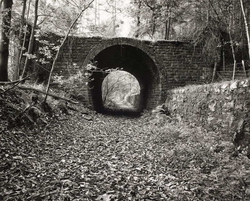
I particularly like the photographs taken by Fay Godwin, as they are in black and white. This gives them a vintage feel and also a sense of mystery. Some of the photographs taken she has been able to catch the light perfectly so that rays of sun are beaming down in a forest. This to be seems magical and could be a setting to a story, it would also seem that these photos were not taken by chance and that she has waited for just the right moment.


Henri cartier-bresson
Bresson creates interesting photographs of different places at different times however, they all have the same feel to them and each of them contain people. I particularly like these two images as there is the use of structure, each in a different way. They are both images of staircases but one is jagged whereas the other is seeming to be perfectly rounded, spiralling upwards.


Steven Klein
One of my favourite photographers is Steven Klein. His work to me seems to draw the eye better than an old fashioned photograph. He has taken pictures of famous celebrities that would in their normal lives would be idolised and seen as beautiful, but in his photographs seem to have an outrageous twist.


Ansel Adams
 
Similar to fay Godwin, Ansel Adams takes black and white photographs that have a magical element to them. He takes into account all the details around him and incorporates them into his work, making a beautiful delicate picture.


Sara Moon
Sara Moon often creates photographs that are slightly distorted, out of focus or have black smudges on them. I like these effects as I think they add something different to her work. There is something elegant yet scary about her pictures, like something you would have seen in the olden days hanging on the wall. She tends to use vintage colours with a more sepia effect on some of them to make them look old fashioned.


John Virtue

 
I have looked at a number of John Virtues pieces of work and I find them very interesting. He is well known for his pieces on the London Skyline, but he specialises in any landscapes. He only works in black and white, ink and paint, as he thinks that colour is an unnecessary distraction. Personally I like the fact that there is no colour to his pieces as this makes it look more edgy and gothic, this portraying what London might have looked like many years ago.


Wednesday 18 September 2013

Mark making and linear drawings

I did these drawings to mirror what we did in class, this includes mark making where there are different feelings on my face. I also tried to do a linear drawing without taking my pen away from the page. Both these methods I did without looking at the paper and just looking in the mirror and closing my eyes.


Monday 16 September 2013

Artists who use non traditional materials

Peter Callesen - Paper cutting

Peter Callesen creates beautiful but fragile creations made from paper that is a magical transformation of a flat sheet of paper into figures. Callesen only uses A4 paper as he believes that as the most commonly used type of paper we are able to see it in a new light and not just as a blank sheet.

This piece I find quite interesting as the leaves falling off the tree look as though they are flying in the breeze to fall randomly on the ground. I think this is accurately portrayed in this image and the cut outs go well with the background paper of brown, this is an autumn colour that relates to the leaves falling. Although the white space around the image is not used, it adds to the simplicity of the piece but in an effective way.


Here are some more examples of his work that I find fascinating. The images with the skeletons of people and angels I find to be very well constructed. They are part of a category called "Fall" which most of his pictures symbolise falling in a different way. However, the bottom piece of the flowers has a great thought process and idea behind it, but you can barely see the cut out shapes at the top. Therefore, I think that he should have created a coloured background to make them stand out more.


Yulia Brodskaya- Quilling artist


Yulia Brodskaya has a different way of working as she creates pieces in the form of quilling. Having made pieces out of quilling myself I know that it is a hard and time consuming task, but looks amazing in the end. She describes quilling as giving paper craft technique a new life and significance in the context of graphic communication.

I like the intricate details of the pieces above. The one of the woman smoking a pipe in particular as there are so many colours included in the face, that it looks like a whole new picture is contained within. I also like the fact that she has included smaller swirls within the bigger ones as this makes it look more interesting. It looks as though someone has edited it on a computer, which is probably where her skills as a graphic designer come in, as she wanted to experiment these with paper.


Sunday 15 September 2013

Design Transformation

I took a book out of the college library on print and material and found an interesting artist called Alexander Henry. He created folklore, fantasy and fable fabrics that could be transformed into a tattoo design which in its self is an art. Another way of working that can relate to tattooing is print making, which can be described as an extension of this natural instinct. Decoration on the body is also supposedly part of evolution.


In the same book I found a nice looking dress which I thought the pattern was interesting, with feathers on. This dress design was called the fluid "red carpet" dress in dragonfly print by Matthew Williamson. A flourish of feathers has always been used to symbolise sexual display, both in the natural world and in fashion. Williamson stated that he liked to experiment with colours particularly turquoise, this is why he uses peacock feathers in some of his work. These particular feathers have the eye motif on them which are known to the superstitious as harbingers of bad luck. 

Saturday 14 September 2013

Unique ways of working


Joe Hill

Optical illusions and 3d art images create amazing effects for unusual interior design. This way of working changes perspectives, bringing in breath-taking illusions into modern floor painting and decorating. Joe Hill is an artist that uses this technique and below is some of his work.


I find this way of working to be very intriguing as it creates an optical illusion tricking the eye. This can be effective in many different ways, as the artist is able to manipulate the audience making them feel how they want them to. An example of this is the image below that if they walked on the floor they would feel as though they are going to fall into the room below, creating panic.


I have seen a number of street artists that use spray paint to create their work but this is a new way of working that no matter who the audience is, any passer by would want to stop to take a look at the art.


Kumi Yamashita

Kumi Yamashita used number shapes, placing them in front of light casting a shadow onto the surrounding area, usually mounted on the wall. The usual shadows are in the shape of humans however there is one that is shown below that is of a cat. This way of working seems almost ghost like, as though its a trick of the light that catches your eye. It also seems as though the silhouette will suddenly vanish and the shapes will blow away in the breeze.


A further way of working by Yamashita was the use of paper origami to cast shadows. Again the shadows made are silhouettes of people. As I have a personal interest in origami I find this fascinating and putting two ways of creating art together to make one piece. All the different kinds of coloured paper may symbolise the different races and personalities of people in the world.


Walking techniques used by artists


Janine Antoni


Janine Antoni practiced tightrope walking for an hour a day until she was able to walk the line of the horizon just in front of the house she grew up in. In Migration, Antoni and Paul Ramirez Jonas walked along the beach, taking turns following in one another's footsteps, and fitting neatly within and replacing one another’s marks. I like this way of recording thoughts and feelings, by including herself in the picture and creating it to fulfil a dream of hers. It is very creative way of working and tightrope walking is a hard thing to do so it shows she put herself out to create this.


Richard Long

Richard Long creates his mark on the environment by using his own body to do so. He walked across a field to create a perfect line in the below picture. It is said that Long remixes natural elements to make simple statements by using his body in the landscape.


Richard Long states:
“Thus walking—as art—provided a simple way for me to explore relationships between time, distance, geography and measurement. These walks are recorded in my work in the most appropriate way for each different idea: a photograph, a map, or a text work. All these forms feed the imagination.” − Richard Long
 
Long also brings natural materials into galleries setting it in exact and deliberate arrangements.


Roger Hiorns


Roger Hiorns took a condemned London flat and turned it into a crystal wonder of copper sulphate. By spraying this all over the flat he was able to create a crystal paradise with dark magical tunnels leading through the whole flat. I particularly like his work as it makes it seem mystical and unique, it is something that has never been done before and by creating this he was able to turn a run down flat into something that everyone can enjoy.


Carla Black


Carla Black creates her work through the use of tissue paper and fabric, all pastel colours that remind me of sweets, as though its made of sugar paper. Through twisting the fabric around each other makes people see that the fabric isn't just flat and boring, and can be used in a more exciting way.
I also like the way that it fills an empty blank space of a room, and being more interactive for the observer.


Hew Locke

Hew Locke creates interesting pieces of figures made out of chains, dolls and flowers. These specific pieces of art are called the Kingdom of the Blind and was created to represent the rise in power of an imagined leader. Locke's intention was to leave the observer with a sense of unease yet fascination.


I visited the Graves Gallery at Sheffield and took the above pictures of Hew Locke's work. I found them particularly interesting in person compared to in a photograph, due to them being life-size. They looked almost lifelike as if they were going to come alive, with the intense stare of the flower eyes.
 
This piece of work reminds me of soldiers riding on horses and all the chains to me seem like they are symbolising the weight of the battle they may be going to fight. I like all the different colour beads as they make the piece more attractive to look at rather than just a soldier on its own.
 

Yinka Shonibare

Yinka Shonibare is an artist from London, he uses his artistic abilities in a fashionable way through textiles and clothes making. In the above picture Shonibare has created a series of outfits that would be portrayed as men's suits, in a brightly coloured material with a number of different patterns on. He created this to make it look like there are people actually wearing the clothes however, they are just dummies holding up the outfit. I think this is a clever way of displaying his artwork as from a glance the observer would expect real people to be sat there instead of dummies.

I like the mask that is displayed in this picture as it has a unusual look to it that you wouldn't expect to be in any shops.
The fox below has been dressed to look like a human being which reminds me of the fox in the Beatrix potter stories. The orange colour of the coat is a daring bright colour, this can relate to the gun that is in the foxes hand as this too is dangerous.


Annette Messager

 
Annette Messager uses unique ways of working. She gathers up everyday objects such as photographs or children's toys to create artwork. Most of the time the objects in her work are suspended on string individually in mid air, or as a collective piece of work on the wall. By using children's toys in her work Messager casts a wide net when it comes to her audience. This meaning that her work is suitable for all ages.


This piece uses the same techniques as the ones with the children's toys however, this is constructed by black and white photographs. Messager has made this piece in the shape of a heart, so this might symbolise the people in these photographs may be close to Messager's heart.

Fiona Rae


Fiona Rae
Lora Zombie  

The thing I like most about Rae's work in this piece is the subtle contrast between the colours. The purple and black colours blend well together, this to the observer, creates a certain mood. For example, in this piece it gives me a sense of sadness and darkness as the drips on the page look as though someone has spilt their tears onto the piece and it has smudged the artwork. This piece in particular reminds me of Laura Zombie's work due to the dripping of the paint and the panda image at the top of the piece. This is because a few of Zombie's paintings were of a pandas.


In this piece I like all the different colours that are used, again there are paint splatters used in the background, and are used in an orange colour to make them stand out. This covers the background of brown, which without the foreground would be overlooked as being boring. In this piece there is a lot going on and could be seen as chaotic, personally I don't usually like this in a piece but Rae makes it work in her favour.


Unlike the other pieces I think this one is too simplistic and there is a lot of empty space in the middle. I also think the black blot ruins the sense of the piece making it the focal point, this moves the rest of the piece into the background which could easily be overlooked.